Seasonality & Its Features
1. Key Notations and Operations
It is important to distinguish between the types of differencing operators used to stabilize a time series:
- Lag \(d\) Difference (\(\nabla_{d} Y_{t}\)): Used to remove seasonality with a period \(d\).
- \(d\)-th Difference (\(\nabla^d Y_{t}\)): If the trend \(m_{t}\) is a polynomial of order \(d\), then applying the \(d\)-th difference will make the series stationary.
2. Understanding Seasonality
Seasonality refers to regular periodic variations where the cycle period is \(\leq 1\) year. It is usually predictable, as seasonal factors show repeating behavior.
- Causes: The cycle of seasons, holidays (e.g., Diwali), regular changes in human behavior, or biological rhythms.
- Examples:
- Biological: Animal migration patterns.
- Retail: Increased sales of coffee and warm clothes in winter; fans and ACs in summer.
- Cultural: Spikes in sales for clothes and firecrackers during Diwali.
- Economic: Unemployment peaks often seen in June.
- Purpose of Study: Studying these patterns allows for better planning regarding temporal changes and helps eliminate non-stationarity for more accurate modeling.
3. Graphical Techniques to Detect Seasonality
Simple TS (Run Sequence) Plot
This is a standard plot of observations against time.
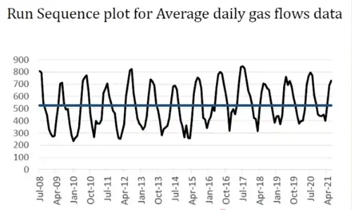
* Mean Line: Often indicated by a horizontal line to visualize the central tendency.
* Identification: Helps identify seasonality, shifts in location (local behavior drifting from the mean), and shifts in variation (heteroscedasticity).
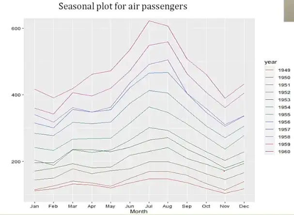
Seasonal Plot
In this plot, each color typically corresponds to one year, with months or quarters on the x-axis.
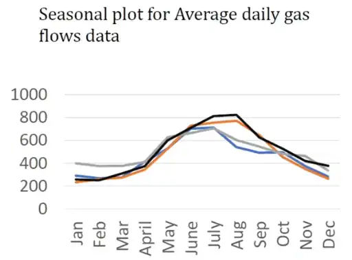
* Comparative Behavior: This allows you to observe behavior across different years for the same period (e.g., comparing August 2021 vs. August 2023).
* Airline Data Example: Useful for visualizing data with strong growth and repeating monthly patterns, such as international airline passengers.
Seasonal Sub-series Plot
This plot groups the data by the seasonal period (e.g., all Januaries, all Februaries) to show evolution over time more clearly.
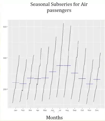
* Extent: Shows the range from minimum to maximum values within that specific period.
* Mean: Horizontal blue lines often indicate the mean for that specific month or quarter across all years.
* Constraint: Note that while it shows trends within a month, it is not primarily designed for comparing absolute numbers between two different months.
Box-plot
The box-plot serves a similar purpose to the #Seasonal Sub-series Plot, but provides a more detailed look at the spread of the data by visualizing quartiles and potential outliers for each seasonal period.